Date:
2015
Description:
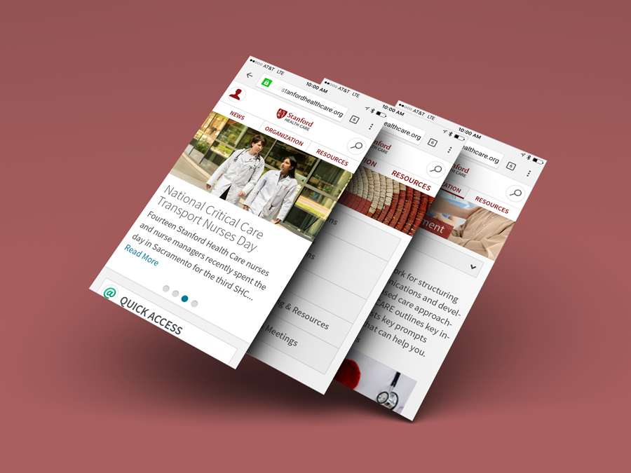
SHC Connect is Stanford's intranet. It is a gathering place for employees to view the latest company news, read and provide information, gather tools, collaborate and communicate.
Problem:
The portal failed to meet to needs of the employees. Certain functionality was out of date, items were hard to access, and it needed a complete visual overhaul.
Solution:
Apply UX research and techniques to gather pain points and insights in order to create an intranet where employees enjoy visiting and can access what they need in order to become more productive.
Starting:
To start this project, I hosted a couple workshops with stakeholders, engineers and various employees to find out more about the intranet. I was able to gather current pain points, insights for areas for improvement, and user sketched wireframes. It is important that before digging into design, that I fully understood the needs of the user. One method that was also used to get started was card sorting. With many variables on the website, we wanted to know what were most important to both individuals and the company.
Research:
I met with 30+ employees from various departments including nurses, department leads, admins and office workers. We did a few rounds of interviews each. By using various UX methods and combining that with existing metrics, I was able to learn about the different tasks of each employee and gather the information I needed to create clickable prototypes for a new intranet. This information was also used to create personas, and site maps.
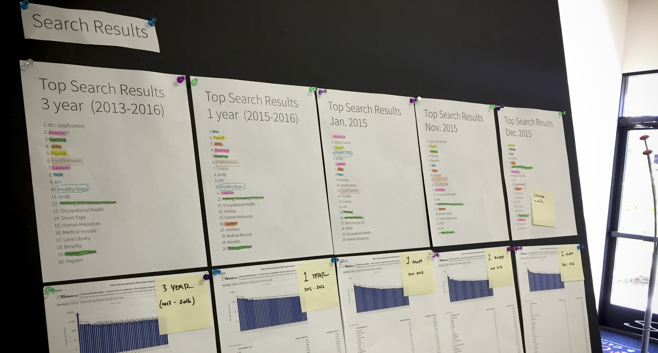
I gathered the top search results over given time periods: 1, 3, & 5 years and individual months to find trends in what users were looking for.
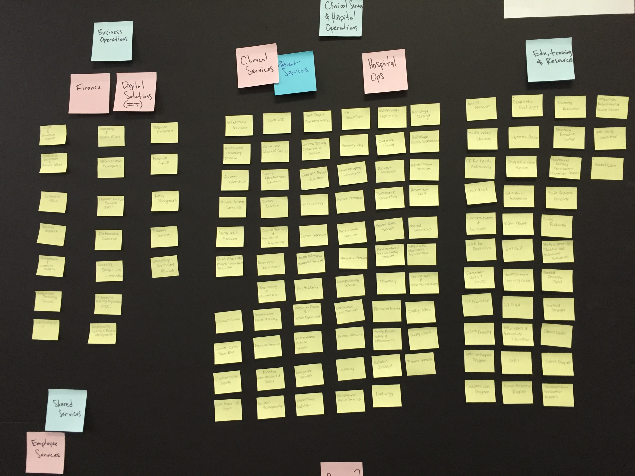
This board was used to give us a better understanding of all departments and where they belonged within an organization.
A proposed site map was created in order to show users how the new site would be reorganized.
User flows were created to document the various access points to obtaining files.
Wireframes & Prototypes:
Starting with mobile, I sketched ideas based on my research.
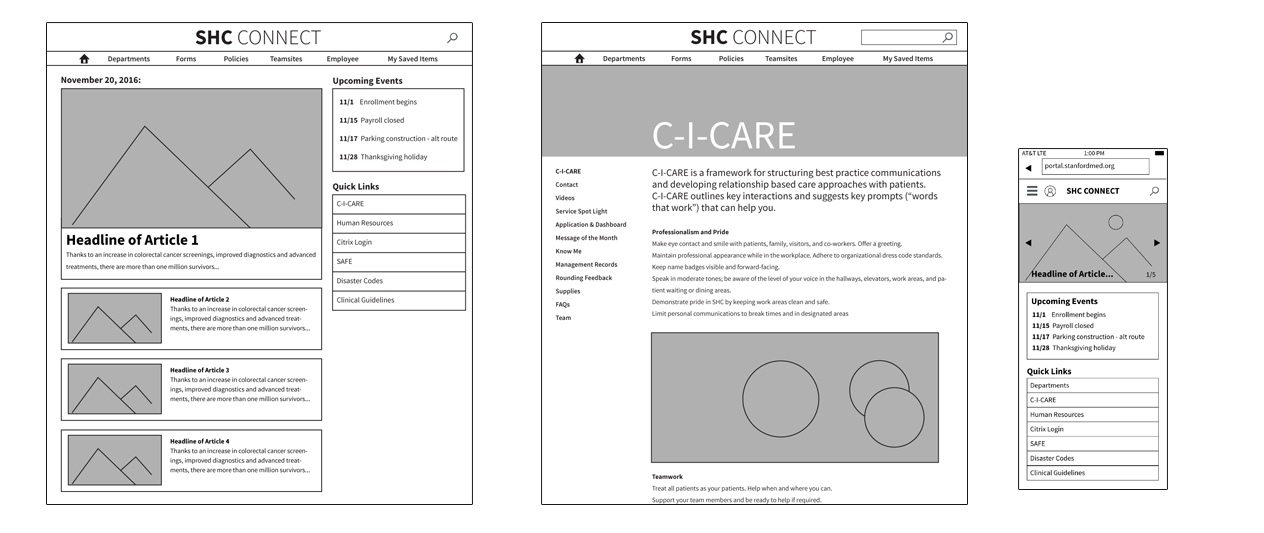
Some early mid-fidelity wireframes used for testing.


