Stanford MyHealth
Description:
MyHealth by Stanford Health Care gives you secure, anytime access to your personal health information. Functionality includes messaging your care team, scheduling an appointment, and viewing and updating your medical records.
Role:
I was one of two UX designers, my role covered understanding product requirements, wire framing, high fidelity prototypes, and writing and conducting user studies.
Solution:
Applied UX research and techniques to design flows and create a user centered experience thru the form of web and mobile app.
Getting Started:
One of the first things we did to kick off this project was speak with stakeholders, patients, and hospital volunteers to gain insights into what the vision for MyHealth was and how that aligned with what the users needed. Through out the process, we had ongoing interviews with 30 patients in person and via WebEx from discovery to validation phases. Our interviews and workshops helped us create a hypothesis to test, gain insights, redesign, and retest.
Wireframes & Prototypes:
In this view, we took certain areas of the website, and under it placed all of the tasks that users would want to do in each category. (The final list was a lot longer, but not pictured)
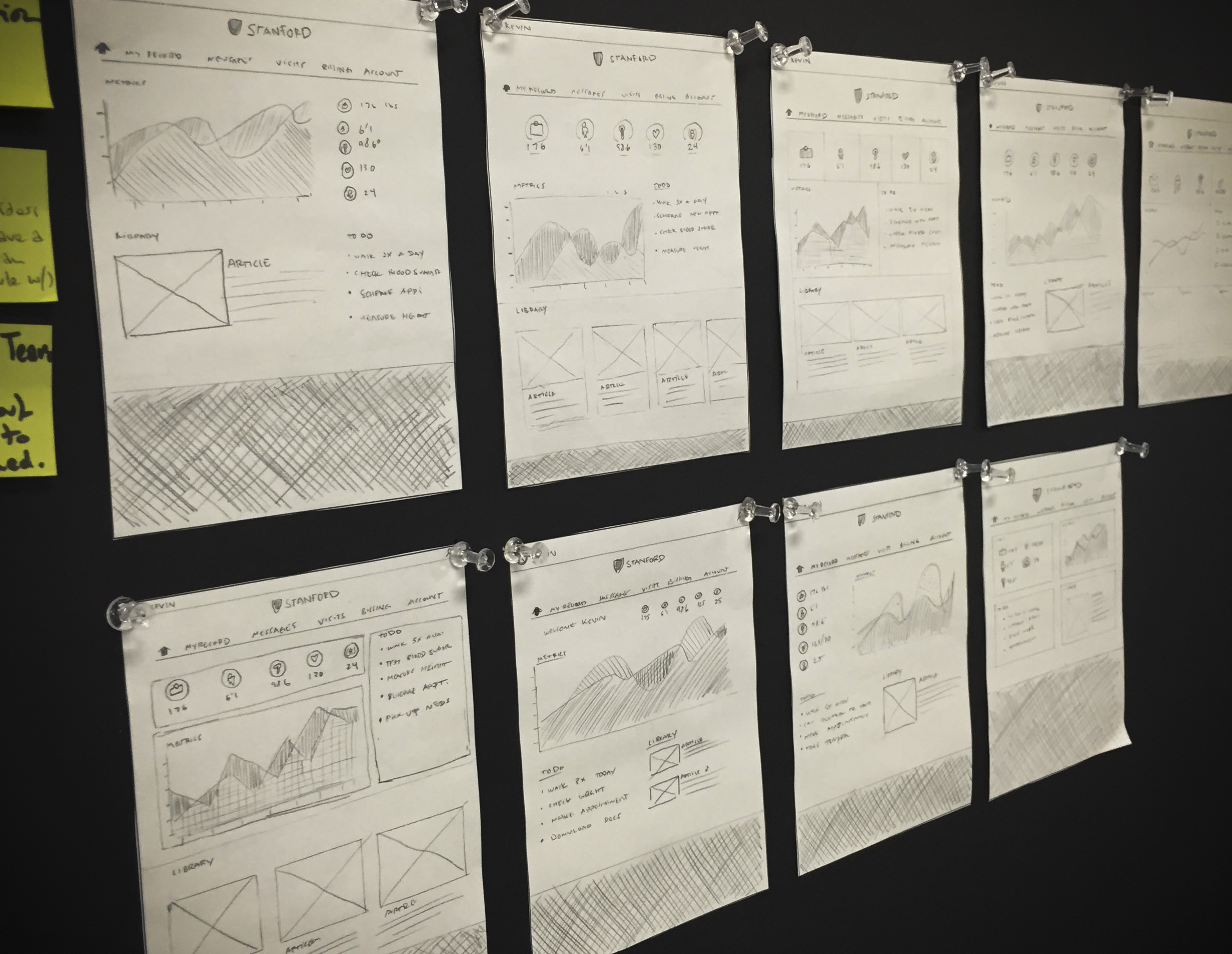
Early pencil sketches for the authenticated landing page.
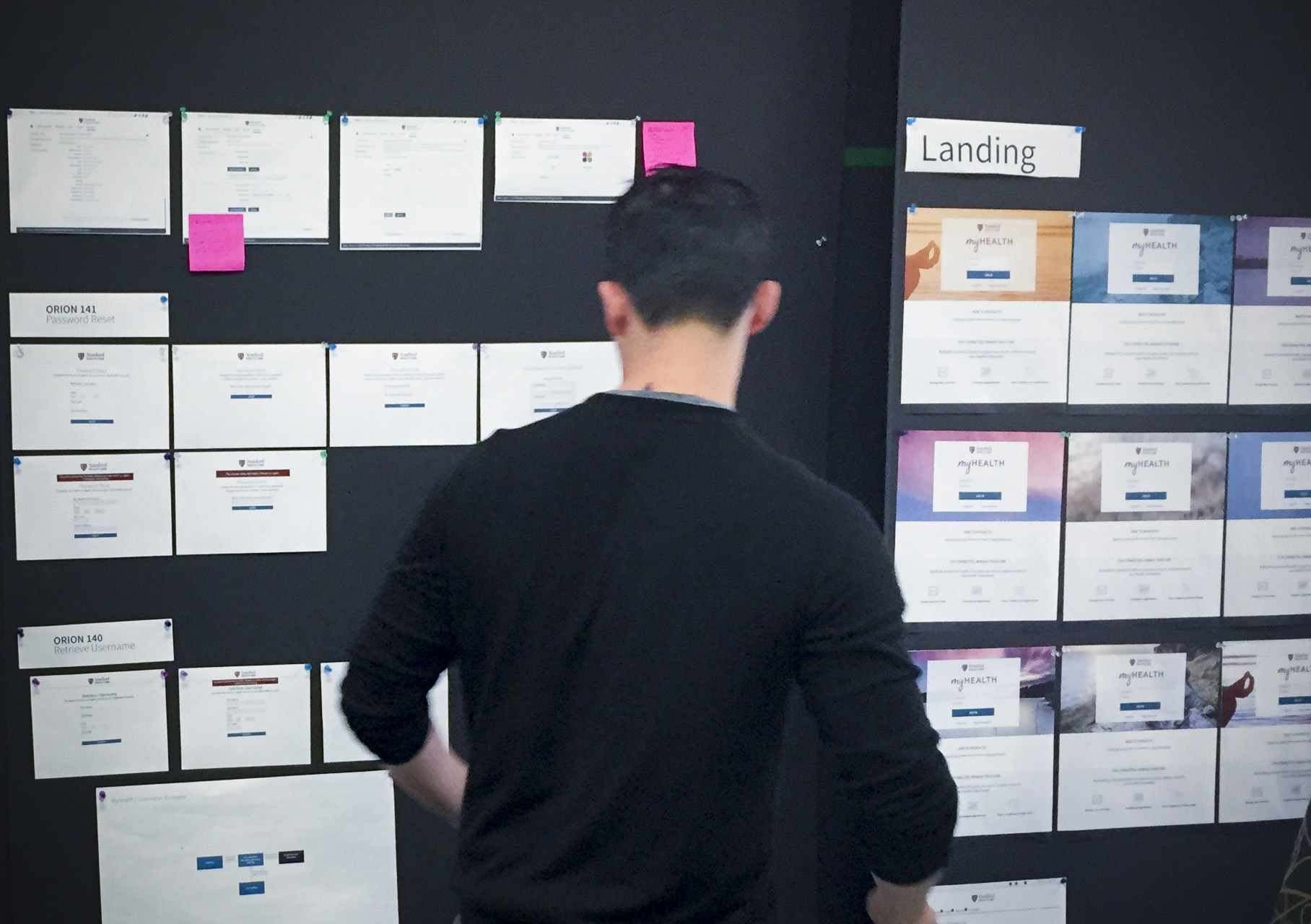
Reviewing site maps, user flows, and unauthenticated landing page design.
Ideas for the MyHealth mobile app.
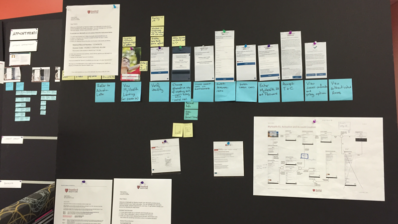
Visualizing the account activation flow
One of the user flows created for credentials.
Work in progress for a hand drawn storyboard that shows how the mobile app will be used during a hospital visit. The final storyboard was used to communicate our vision to stakeholders and was well received.
The Outcome:
In February 2015, Stanford's MyHealth was launched and is going strong today. Users have increased dramatically. Functionality and improvements continue to be added. Prior to launch there were roughly 170,000 users compared to over 270,000 (much more satisfied users) today and counting.


